
- Installation Steps
- Create a Page
- Create a blog
- Navigation Menu
- Create a products collection
- Recommended Images size
- Configuration Settings
-
Configuration All Section Settings
- Announcement bar section settings
- Header section settings
- Offer banner section settings
- Slideshow section settings
- Rich text section settings
- Featured collection section settings
- Image Banner section settings
- Collection list section settings
- Parallax section settings
- Email signup section settings
- Blog posts section settings
- Image with text section settings
- Testimonial section settings
- Video section settings
- Multicolumn section settings
- Custom Instagram Image section settings
- Footer section settings
- Collection Page settings
- Configuration Basic Settings
Pandora – Responsive Shopify theme
FEATURES:
- Direct to checkout
- Related products
- Inventory quantity bar
- Ajax Filter
- Multiple Collection page option
- Quick view Smart
- Search suggestions
- Mega Menu
- Mini - Cart with Drawer
- Add to Wishlist
- Instagram Feed
- Unlimited Languages
- Unlimited Currency
- Size Guide Pop up
- Multiple Product Page option
- Social Sharing
- Multiple header option
- 100% responsive design
1. Installation Steps
Go to your store "Admin > Online store"
- Go to add theme option and upload the theme zip file to your store.
- Go to the Action option and publish the theme.

2. Create a Pages
Go to your store "Admin > Online store > Pages > Add page" button. Give the title of the page and content of the page then click on the save button.


3. Create a Blog
Go to your store "Admin > Online store > Blog posts > Add blog post" button. Give the detail of the blog, upload the featured image and select the visibility visible option then click on the save button.


4. Navigation Menu
Go to your store "Admin > Online store > Navigation > Add menu" option.
Give the title of the menu and add menu items you want in your store then click on the save button.

5. Create a products collection
Go to your store "Admin > Online store > Products > Collections" option.
Below screenshot top right side corner click on create collection button and give the detail of the collection and save it.
6. Recommended Images size
- Header section logo image size is (250 X 125)px
- Offer banner section banner size is (1900 X 100)px
- Slide show section main banner size is (1900 X 710)px
- Featured collection section product image size is (734 X 1040)px
- Image banner section image size is (1500 X 505)px
- Collection list section image size is (750 X 1000)px
- Parallax section image size is (1900 X 1080)px
- Blog section image size is (1482 X 1020)px
- Image with text section image size is (750 X 850)px
- Testimonial section image size is (200 X 200)px
- Video section image size is (1060 X 520)px
- Multicolumn section icon image size is (200 X 200)px
- Instagram section image size is (750 X 850)px
7. Configuration Settings
Go to your store "Admin > Online store > Themes > Customize" option.
-
7.1 Default skin color settings
Go to "Customize > Theme settings > Colors"

-
7.2 Font settings
Go to "Customize > Theme settings > Typography"
 Headings:
You can enable and disable the heading font here. If you want to use other fonts then disable the theme font option and select the font from the below option.
Body:You can select the body font you want.
-
7.3 Theme settings
Go to "Customize > Theme settings"
 Layout:
You can set store layout here.
Buttons:You can set all the button settings styles from here.
Products cards:You can set all products card settings from here.
Collection cards:You set the all collection list settings from here.
Media:You can set almost all the images settings from here.
Cart:You can configure cart drawer settings from here.
Wishlist:You can configure wishlist page settings from here.
8. Configuration All Section Settings
Go to your store "Admin > Online store > Themes > Customize" option.
-
8.1 Announcement bar section settings

Go to "Customize > Announcement bar" section.
 Auto-rotate slides:
Enable/Disable auto rotate slides.
You can set a time for changing slides.
Go to "Customize > Announcement bar > Announcement bar block" section.
 Text:
Text:Set text for the announcement bar block you want.
Background color:Select the background color for the announcement bar block.
Text color:Select text color for the announcement bar block.
Link:Set the redirection link for the announcement bar block you want.
-
8.2 Header section settings

Go to "Customize > Header" section.
 Color scheme:
Select a color scheme for the header section.
Image:You have to choose the background image option from the color scheme then you can use this option. If you want to use a background image in the header then select this option and upload the image.
Custom color:select the background and text color you want. If the color scheme is selected as a custom color then you can use this option.
Logo Image:Select the logo image you want. (Recommended image size is 250X125)px
Desktop logo position:Select the suitable option for your store header. You can change the menu and logo position using this option.
Menu:Select the menu for navigation.
Desktop menu type:Select the style for the menu.
Enable sticky header:Enable the option for sticky header.
Enable wishlist:Enable wishlist for display in header.
Social icon:Enable/Disable the social icon on the desktop view.
-
8.3 Offer Banner section settings

Go to "Customize > Offer banner > Offer banner block" section.
 Image:
Add/Upload the offer banner image you want. (Recommended image size is 1900 X 100)
Image url:Set the redirection link of the image.
-
8.4 Slideshow section settings
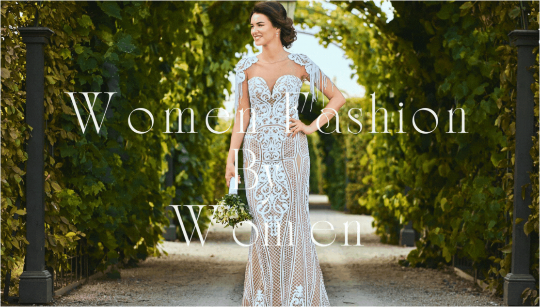
Go to "Customize > Slideshow" section.
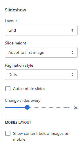 Layout:
Select the layout you want.
Slide height:Select the slide image height you want.
Pagination style:Select the pagination style you want.
Enable the auto-rotates slides option for rotating images.
You can set any time between ranges for rotating the image.
Go to "Customize > Slideshow > Slideshow block" section.
 Image:
Add/upload the image you want. (Recommended image size is 1900 X 710)
Mobile Image:Add/upload the image for mobile devices. (Recommended image size is 750 X 850)
Heading:Set the heading text you want.
Subheading:Set the subheading text you want.
Button label:Set the button label you want.
Button link:Set the redirection link of the button.
Desktop content position:Set the content position on the desktop.
Desktop content Alignment:Set the content alignment on the desktop.
Color scheme:Select the color scheme for content. When you use this option then enable the Show container on the desktop option.
-
8.5 Rich text section settings

Go to "Customize > Rich text" section.
 Desktop content position:
Set the content position on the desktop.
Content Alignment:Set the content alignment.
Color scheme:Select the color scheme for content.
Enable/Disable animation:If you want to set the rich text section will be full width then enable the make section full width option.Enable or disable animation from here.
Go to "Customize > Rich text > Rich text block" section.
 Heading:
Set the heading text you want.
Text:Set the description text you want.
Buttons:Set the button label and redirection link of the button.
8.6 Featured Collection section settings

Go to "Customize > Featured Collection" section.
 Heading:
Set the heading text you want.
Heading size:Set the heading size you want.
Description:Set the description text you want.
If you want to show collection description from admin then enable the option.
Description style:Set the description style you want.
Collection:Select the products collection from collection list.
How many products to show then set a maximum product to show option.
How many columns to show then set a number of columns on the desktop option.
If you want to set the product section will be full width then enable the make products full width option.
View all style:Set the button label style you want.
Enable the carousel on desktop option for a slider on desktop view.
Color scheme:Select the color scheme option for the section.
Enable/Disable animation:Enable or disable animation from here.
Product Card Settings:-Image ratio:Select the image ratio you want.
If you want to show a second image on mouse hover then enable the show second image on hover option.
Show vendor:Display vendor then enable the option.
Show product rating:To display the rating then enable the option.
Enable quick add button:To display the add to cart button on the products then enable the option.
8.7 Image Banner section settings

Go to "Customize > Image banner" section.
 Layout:
Select the layout you want.
First image:Add/Upload the image you want. (Recommended image size is 1500 X 505 )
Banner height:Select the banner height you want.
Desktop content position:Select the desktop content position you want.
Enable/disable option show container on desktop.
Desktop content alignment:Select the content alignment position you want.
Color scheme:Select the color scheme for the content.
8.8 Collection list section settings

Go to "Customize > Collection list" section.
 Heading:
Set the heading text you want.
Image ratio:Select the image ratio you want.
Set the number of columns on the desktop device.
Color scheme:Select the color scheme you want.
Enable/Disable animation:Enable or disable animation from here.
Select the “View all” button option for the display of the view all button.
Mobile Layout Settings:-Set the number of columns on the mobile device.
Enable swipe on mobile option for slider.
Go to "Customize > Collection list > Collection block" section.
 Collection:
Select the products collection from the collection list.
8.9 Parallax section settings

Go to "Customize > Parallax" section.
 Layout:
Select the layout you want.
Prallax image:Add/Upload the image you want. (Recommended image size is 1900 X 1080)
Prallax mobile image:Add/Upload the image you want. (Recommended image size is 750 X 850)
Icon:Add/Upload the image icon you want. (Recommended image size is 103 X 94)
Title:Set the title text you want.
Sub title:Set the sub title text you want.
Button label:Set the button label you want.
Button link:Set the redirection of button link you want.
Background Color:Select the background color you want.
Text Color:Select the text color you want.
Button Background Color:Select the button background color you want.
Button Text Color:Select the button text color you want.
Desktop content position:Select the desktop content position you want.
Desktop content alignment:Select the content alignment position you want.
8.10 Email signup section settings

Go to "Customize > Email signup" section.
 Color scheme:
Select the color scheme for the email signup section.
If you want to make section full width then enable the Make section full width option.
Newsletter background image:Add/upload the background image you want. (Recommended image size is 1900 X 710).
Top padding:Set the top spacing for email signup section.
Bottom padding:Set the bottom spacing for email signup section.
8.11 Blog posts section settings

Go to "Customize > Blog posts" section.
 Heading:
Set the heading text you want.
Heading Size:Set the heading font size you want.
Blog:Select the blog from a created blog post list.
Select the range of a number of blog posts to show.
Select the range of a number of columns on the desktop.
Color scheme:Select the color scheme for the blog section.
If you want to display animation in this section then enable the Enable/Disable animation option.
Show featured image:To display the image enable this option.
Show date:Enable this option for the display date.
Show author:Enable this option for the display author.
To display the view all button then enable this option.
8.12 Image with text section settings

Go to "Customize > Image with text" section.
 Image:
Add/Upload the image you want. (Recommended image size is 750 X 850 )
Image height:Select the image height you want.
Desktop image width:Select the image width you want.
Desktop image placement:Select the image position you want.
Desktop content position:Set the content position in desktop view.
Desktop content alignment:Set the content alignment in desktop view.
Content layout:Select the content layout you want.
Color scheme:Select the color scheme you want.
Mobile layout settings:-Mobile content alignment:Set the content alignment in mobile view.
Go to "Customize > Image with text > block" section.
 Heading:
Set the heading text you want.
Content:Set the content text you want.
Button label:Set the button label you want.
Button link:Set the redirection link for the button.
8.13 Testimonial settings

Go to "Customize > Testimonial" section.
 Heading:
Set the heading text you want
Description:Set the description text you want.
Heading alignment:Select the heading alignment position you want.
Image width:Select the image width you want.
Image ratio:Select the image ratio you want.
Select the range of number of columns on desktop.
Content Alignment:Select the content alignment position you want.
Column Alignment:Select the column alignment position you want.
Secondary background:Select the background color for the column.
Color scheme:Select the color scheme you want.
If you want to display animation then enable the Enable/disable animation option.
Enable the carousel on desktop option for a slider on desktop view.
Go to "Customize > Testimonial > Column block" section.
 Image:
Add/Upload the author/client image you want. (Recommended size is 200 X 200)
Heading:Set the heading text you want.
Subject:Set the author/client name.
Description:Set the description you want.
Link label:Set the link label you want.
Link:Set the redirection link you want.
8.14 Video section settings

Go to "Customize > Video" section.
 Heading:
Set the heading text you want.
Heading size:Select the heading size you want.
Image:Add/Upload the image you want. (Recommended image size is 1060 X 520 )
URL:Set the redirection link for youtube video url.
Make section full width:If you want to make this section full width then enable this option.
Color scheme:select the color scheme you want.
If you want to display animation in this section then enable the Enable/Disable animation option.
8.15 Multicolumn section settings

Go to "Customize > Multicolumn" section.
 Add class name:
If a class has already been added then do not remove the class name.
(Note: Do not edit or remove the class.)Heading:Set the heading text you want.
Image width:Select the image width you want.
Select the number of columns on the desktop view.
Column alignment:Set the column alignment you want.
Secondary background:Select the background color for the column.
Color scheme:Select the color scheme for this section.
If you want to display animation in this section then enable the Enable/Disable animation option.
Mobile layout settings:-The select number of columns you want to display on mobile view.
Enable the Enable swipe on mobile option for a slider on a mobile view.
Go to "Customize > Multicolumn > Column block" section.
 Image:
Add/Upload the icon image you want. (Recommended image size is 200 X 200)
Heading:Set the heading text you want.
Description:Set the description text you want.
Link label:Set the link label you want.
Link:Set the redirection page link you want.
8.16 Custom Instagram Image section settings

Go to "Customize > Custom Instagram image" section.
 Heading:
Set the heading text you want.
Sub Heading:Set the sub heading text you want.
Heading size:Set the heading text size.
Heading alignment:Set the heading text position you want.
Image ratio:Select the image ration for the images.
If you want to make this section full width then enable the make products full width option.
Color scheme:Select the color scheme you want.
If you want to display animation in this section then enable the Enable/Disable animation option.
Select the range of background hover color radius you want.
Select the number of columns on the desktop view.
Enable the Enable carousel on desktop option for a slider on a desktop view.
Go to "Customize > Custom Instagram image > image block" section.
 Custom Img:
Add/Upload the custom image you want. (Recommended image size is 750 X 850)
Image link:Set the redirection link of the image.
8.17 Footer section settings

Go to "Customize > Footer" section.
 Color scheme:
Select the color scheme you want.
Custom color:Set the custom color for the footer section.
Background image:Select the background image you want.
(Note: You can use this option when the color scheme is selected as a background image.)Email signup:Enable the show email signup option to display the newsletter.
Heading:Set the newsletter heading.
Social media icons:Enable the show social media icons option for displaying social media icons.
Country/Region selector:Enable the country/region selector option to display a currency.
Language selector:Enable the language selector option for displaying a language.
Payment methods:Enable the show payment icons option for displaying payment icons.
Go to "Customize > Footer > image block" section.
 Image:
Add/Upload the footer logo image you want. (Recommended image size is 200 X 200)
Image width:Set the image width you want.
Select the image alignment you want.
Go to "Customize > Footer > Menu block" section.
 Heading:
Set the menu heading you want.
Menu:Select the menu for the navigation.
8.18 Collection Page settings
(1) Collection banner section settings

Go to "Customize > Default Collection Page > Collection banner" section.

Enable the show collection description option to show the description.
Enable the show collection image option to show the image.
Color scheme:Select the color scheme you want.
(2) Product grid section settings

Go to "Customize > Default Collection Page > Product grid" section.
 Product per page:
Select the range of how many products to display per page.
Select the number of columns for desktop view.
Product Card Settings:-Image ratio:Select the image ratio you want.
If you want to show a second image on mouse hover then enable the show second image on hover option.
Show vendor:Display vendor then enable the option.
Show product rating:To display the rating then enable the option.
Enable quick add button:To display add to cart button on the products then enable the option.
Filter and Sorting Settings:-Enable filtering:You can enable/disable the filter option.
Desktop filter layout:Select the filter layout you want.
You can enable/disable the Sorting option.
Mobile layout:-Select the number of columns to display on mobile view.
9. Configuration Basic Settings
-
(1) Payments method settings
Go to your store "Admin > Settings > Payments" option.
Here you can add payment methods you want.
-
(2) Checkout and accounts settings
Go to your store "Admin > Settings > checkout and accounts" option.
Here you can set checkout and account related settings.
-
(3) Shipping and delivery settings
Go to your store "Admin > Settings > Shipping and delivery" option.
Here you can set shipping and delivery related settings.
-
(4) Language settings
Go to your store "Admin > Settings > Language" option.
Here you can add language and change the default language.
-
(5) Country/region settings
Go to your store "Admin > Settings > Payments > Manage > Countries regions" option.
Here you can add country/region.
-
(6) How to add all images settings
Go to your store "Admin > Settings > Files" option.
Here you can upload single and multiple images.